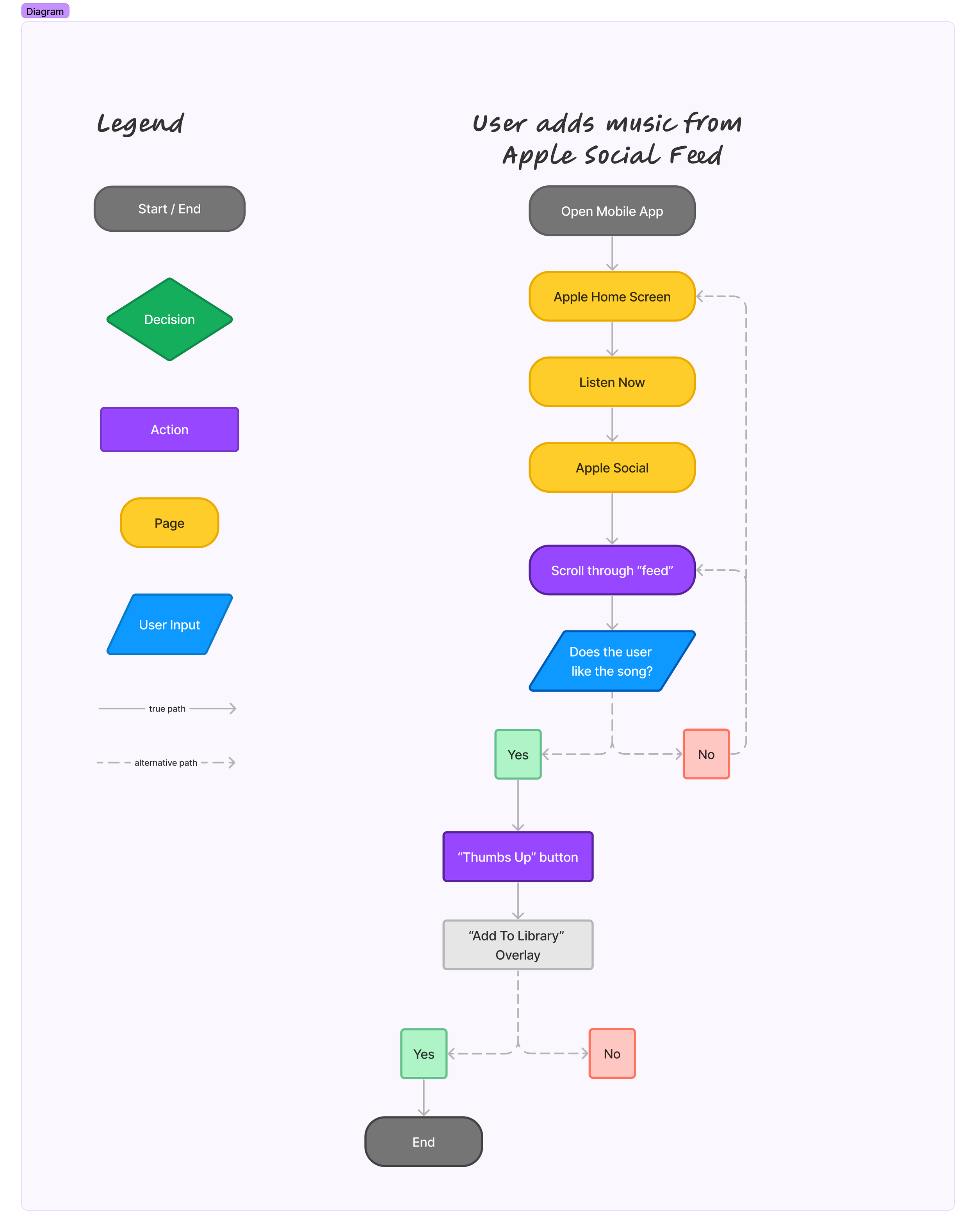
Apple Social

Apple Social is an additional social feature to Apple Music where users can choose to interact and view friend’s activity and preferences on the app

Adding a Feature
Role: UX/UI Designer
Duration: ~75 hours
Background
Apple Music is an audio and video streaming service that caters to over 100 million users worldwide. The service includes popular radio stations, music videos, playlists and other features that allow for users to seamlessly use in their everyday lives.
From my initial research and use of the platform, I recognized the lack of social features like other competitors in the music streaming market. Platforms such as Spotify and Soundcloud have a sense of community where users can scroll a feed of what their friends are listening to and recommend. The current Apple Music user can choose to share specific songs and playlists through messages and other social media sites but not on the app through a “feed” or separate page.
Problems
Goals
The goal was to create a feature where users could view their friend’s activity on Apple Music whether it be suggested playlists, what they’re listening to, favorites etc.
Research
“Understanding the market and users”
I conducted competitive analysis on three similar existing companies which gave me a broader scope on issues faced, and potential solutions while also providing insight into both customer and company preferences.
I conducted interviews with perspectives from users to better understand how users are attracted to and use music streaming platforms. I want to explore and pain points and challenges faced when using these products while also exploring which features are most appealing which draws them back.
Competitive Analysis
Analyzing four competitors on the market allowed me to identify the platform’s strengths and weaknesses. Each of the competitors had integrated at many features, some that others didn’t have. My goal during this analysis was to compare and contrast the companies.

User Interviews
I conducted interviews with 9 participants that use various kinds of music streaming service to better understand the driving factors in subscribing and to gain insight into opinions and various pain points on the platforms. My main goal was to identify similar trends among users and to learn if additional features would benefit their overall experience.
Some key takeaways from the interviews and competitive analysis were
All participants use one or more music streaming platforms in their everyday lives, heavy preference to the mobile platform instead of desktop
Participants show loyalty to first platform they used or tried due to the accumulative data and history Lack of organization tools to track tasks
Apple Music participants agree a profile and adding friends would better connect users and drive user engagement
Define
After having completed interviews and having a basic understanding of needs and pain points to note, I created an imaginary user embodying various traits of interviewees and created a final user persona. This persona helped me understand the user I was designing for and helped guide my ideation process.

After conducting interviews, creating personas, delving into the research and completing simple brainstorming POVs & HMW exercises, I focused on the user’s needs and wants and began creating structure to the website.
Creating simple user flows helped me better visualize the user’s path in completing important tasks and navigating the site.
Sitemap Structure
Design

low fidelity wireframe

Keeping in mind all the research that went in before this stage, I began my design process and initially started with some messy sketches to get my ideas down on paper. After sketching my ideas and deciding what would be necessary with the help of my mentor, I created my higher-fidelity mockups through Figma.
hi-fidelity wireframe
UI Design
After finalizing mockup designs and creating various screens the user would encounter, it was finally time to delve into the visual UI aspect of the platform. I started with creating a mood board to capture the brand in its’ entirety and any inspirations that would come. In doing so, I was able to brainstorm and begin designing my UI Component Library to solidify my choices in reflecting the company’s brand values and overall theme. This was my favorite aspect and section of the project as it challenged my design eye while keeping the new UX information I had learned in practice. It was especially challenging finding the source fonts and iconography through Apple due to licensing but thanks to assistance from my mentor and through various sources, I was able to capture to the best of my abilities the style and features that Apple strives to produce.

Prototype & Testing
With my visual design backed by research in place and with the feedback from peers and mentor, I moved onto higher fidelity mockups and prototyping to test my features and navigation.


Usability Testing
Conducting usability tests at this stage was important because it allowed me to identify and validate what needed to stay or go in terms of design and flow. I needed opinions and feedback from various participants to help test out and evaluate my prototype. In order to do this I conducted another round of interviews but this time, testing task flow prototypes I had created with real users. During the testing, users had to complete two tasks.
Task 1
Navigate and identify new social feature and explore
Task 2
Select a song from follower and add to library
My initial measure of success was timing of task to completion and degree of understanding from users. I made sure to make note of any errors made or if they deviated from the task and any other key note we came across. I also included a degree of difficulty (1-3, 3 being the hardest) for the users to grade the task upon completion. My key takeaways from my usability testing were as follows
5 out of 5 participants agree the new feature is on brand with current company brand values and design
5 out of 5 participants agree the design execution is almost identical to the real app
1 out of 5 participants mentioned the new feature was hidden in the layout and could be improved on to boost visibility that there is a new feature
3 out of 5 participants mentioned they would like to see more interactive buttons and choices like the app itself
1 out of 5 participants mentioned the Apple Social feature logo/icon could use improvement to better represent the feature
5 out of 5 participants completed the task in a timely manner
3 out of 5 participants completed the task in what seemed like seconds and they attributed their success in being already being used to the Apple music platform
1 out of 5 participants mentioned they would have liked to see more features available to test out
4 out of 5 participants stated interest in the feature stating they would like to see it implemented into the real world
2 out of 5 participants mentioned they would like to see a confirmation screen (overlay) to confirm they have added to library and completed task
Revisions
Due to constant updating on design based on feedback instead of waiting until the end, I had very few revisions in terms of the functionality of the product. Based on feedback from my users and my mentor, I made some minor UI related visual tweaks in the design. You can read more about it in depth here

Conclusion

This project helped me gain valuable insight in working with an existing brand while using their established UI into my own design. Dealing with a product that I personally use gave me gratification in creating something that I would personally use. This project gave me a lot more practice in interviewing and creating dialogue with users and potential customers as well. Some key takeaways from this project are
Delve deeper into user research and embrace the research as more is better
Constant contact and feedback is important and helps to make iterations as you go
Adhere to design standards when it comes to brands that already exists, understanding most companies with have their own design elements and styles and components
Keeping the focus and scope of the project in mind and not focusing on multiple minor issues
Going forward, I’d like to explore ways to prototype more functionalities of the platform to further engage the user. Further steps would be to explore ways to expand the features available to the platform to better mimic the actual product. Overall, despite the challenges and difficulties I faced, I learned a lot about myself as a designer and my future as a UX/UI designer. I learned which skills to focus on and which skills I need to hone for future projects.
Thanks for being a part of my journey!