Waggin
Waggin is an end-to-end application that users can use to enhance their daily walks with their pups. Dog owners often have a hard time finding suitable areas for their dog to walk and enjoy an enriching time outside besides “the usual route.” As a high energy dog, and quite large at 70 lbs, my dog needs exercise and enrichment so he does not feel so cooped up in my apartment. Dog parks and nearby trails can be unpredictable at times when it comes to large crowds and can be overwhelming to an anxious dog.


End to End Application
Role: UX/UI Designer
Duration: ~12 weeks
I identified that current event planning platforms are often confusing and difficult to navigate causing unnecessary stress to the event planner.
Problems
Taking advantage of the mobile society we live in today I wanted to create a mobile first platform that allows users to plan for their next event using a simple and stress-free layout to coordinate and organize their upcoming event.
Goals
Methodologies
Research
I conducted competitive analysis on three similar existing companies in the field which gave me a broader scope on issues faced, and potential solutions while also providing insight into both customer and company preferences.
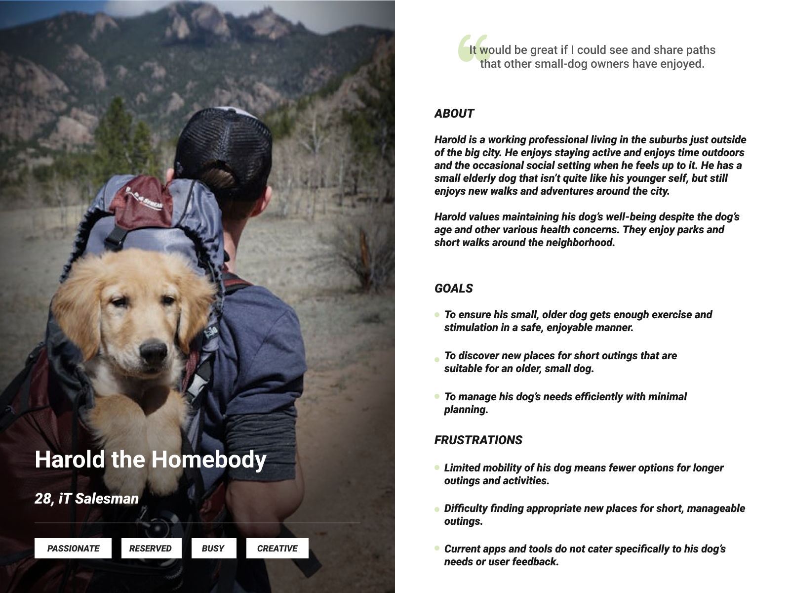
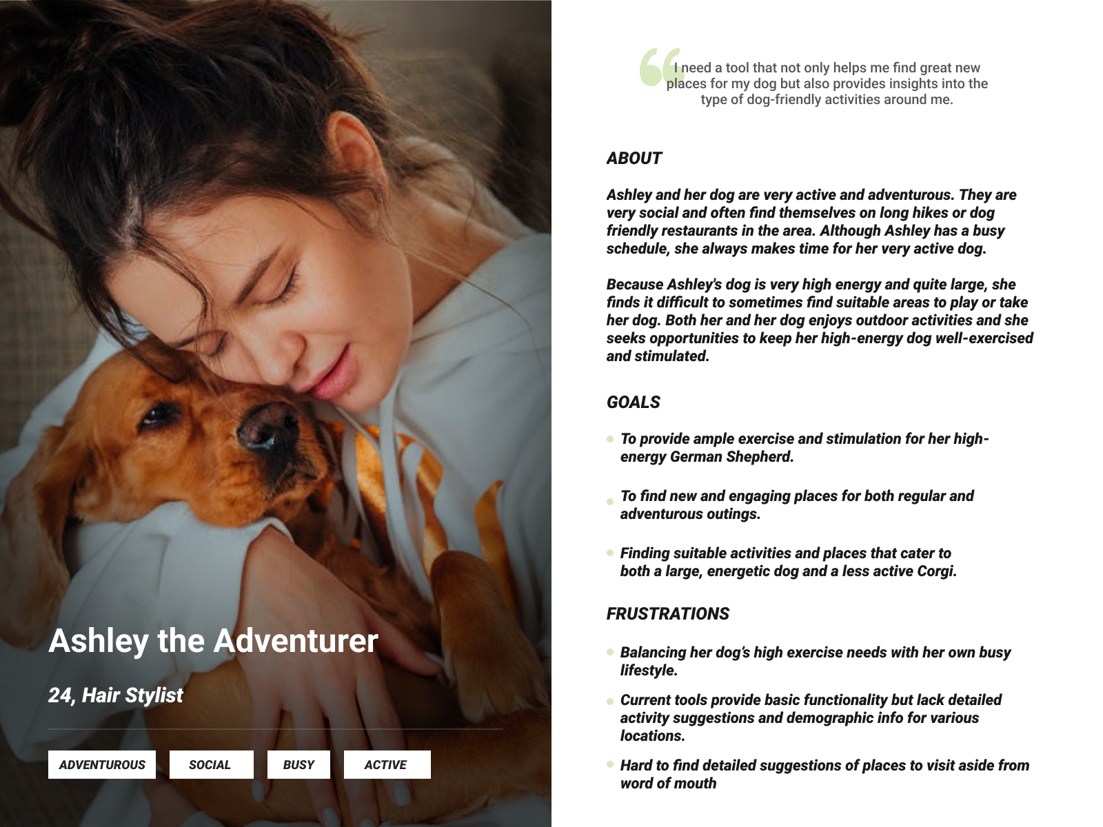
I conducted interviews with perspectives from dog owners to better understand their pain points and similarities. These interviews would later help me form personas to better encapsulate the various personality styles and preferences.
Competitive Analysis

User Interviews
Some key takeaways from the interviews and competitive analysis were
All who were interviewed agree that there is currently no leading app or platform where users can find everything that Waggin would be able to provide in one convenient app.
Majority of dog owners share concern if they are adequately exercising their dogs and providing an enriching fun walk every time
All participants have heard of at least 1 of the 3 competitive businesses and are intrigued to learn more about what Waggin has to offer
Missing features from certain competitors can provide insight into what is needed in our application
I carried out interviews with 5 individuals in their mid 20’s to 30’s who own dogs of varying activity levels. I wanted to have my sample best represent the many various breeds and activity levels of dogs out in the world. Participants were interviewed for roughly 20 minutes over video call to get a better understanding of my audience and potential users
Using real-life data collected through user interviews and competitive analysis on top of the ones I conducted above, I created 2 user personas that best embodied the personalities and needs and wants that a user could possibly encounter. Creating these user personas was very important because it fleshed out the potential user and their various needs and wants along with their expectations.
Define
After conducting interviews, creating personas, delving into the research and understanding the general idea I would like to take the application, I focused on the user’s needs and wants and began creating structure to the website.
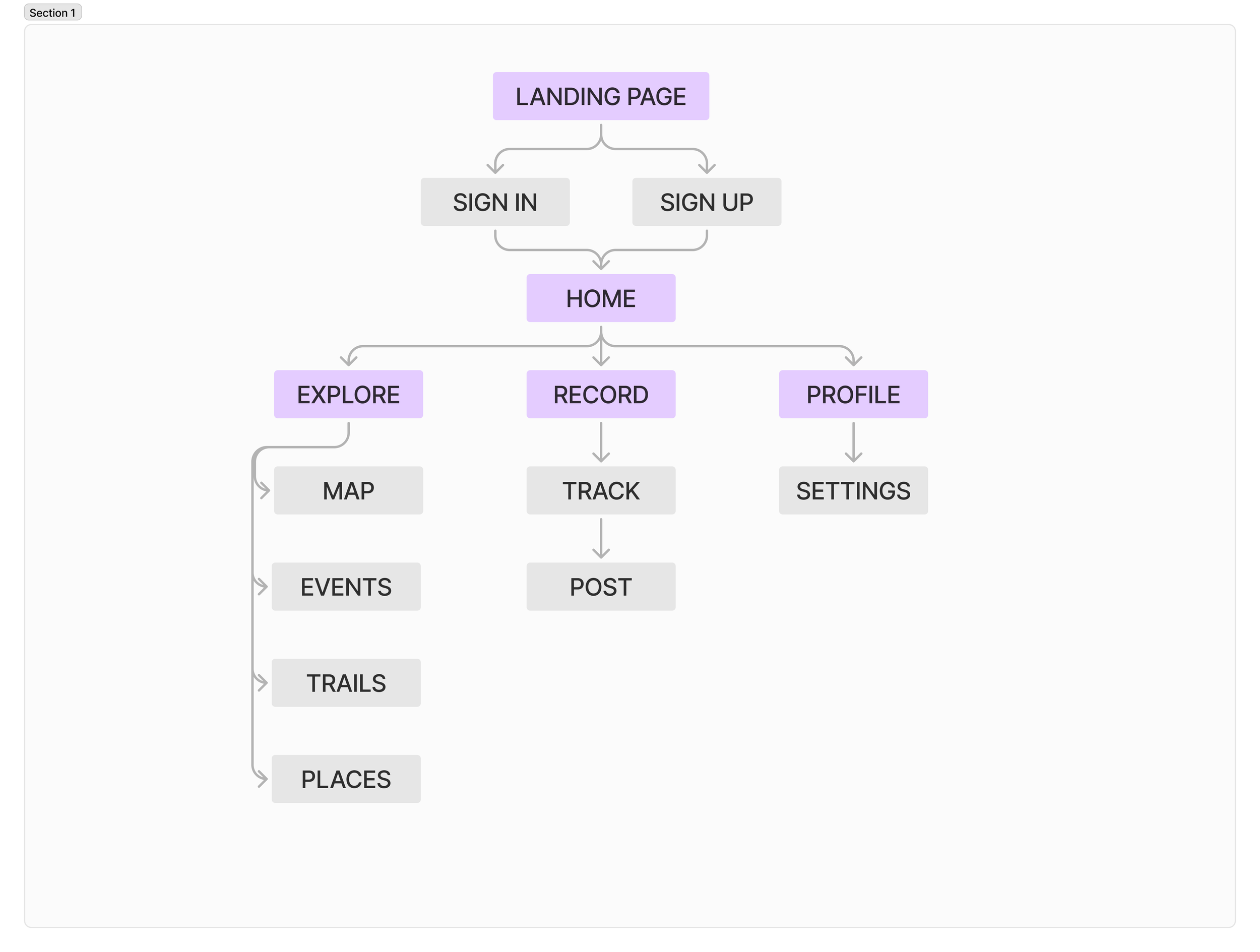
Creating the user and task flows helped me visually get a better understanding of the user’s path in completing important tasks and navigating the site.
Sitemap Structure

Design

Keeping in mind all the research that went in before this stage, I began my design process and started with some low fidelity wire-framing to get my initial thoughts down. Low fidelity work helped me better envision how the user flows and tasks would operate.
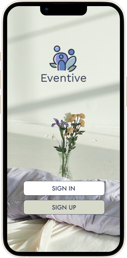
low fidelity wireframe
Brand Style Tile & UI Library
After finalizing mockup designs and minor testing to assure no dead spots during the tasks or general issues, I was able to brainstorm and begin designing my UI Component Library that would later reflect my brand values and theme. This was again, my favorite section of the project as it challenged my design eye while keeping the new UX information I had learned in practice.

Prototype & Testing
With my visual design backed by research in place and with the feedback from peers and mentor, I moved onto hi-fidelity mockups and prototyping to test my features and navigation. I conducted usability testing focused on evaluating the wireframes, interactive prototype, and final visual design. My primary goal was to ensure each feature was intuitive, met user needs, and aligned with the overall gaming experience.


Usability Testing
Conducting usability tests at this stage was important because it allowed me to evaluate and assess the ease of use and general usability of main screens. It also allowed me to measure how well the new screens mesh with brand values and themes
Lastly, usability testing helped me identify and evaluate any dead spots or pain points during navigation of key screens. I needed opinions and feedback from various participants to help test out and evaluate my prototype. In order to do this I conducted another round of interviews but this time, testing task flow prototypes I had created with real users. During the testing, users had to complete two tasks.
Task 1
Onboarding & Creating an account, navigating through app
Task 2
Navigate to the record tab and simulate a recorded walk with your dog.
My initial measure of success was timing of task to completion and degree of understanding from users. I made sure to make note of any errors made or if they deviated from the task and any other key note we came across. My key takeaways from my usability testing were as follows
All the participants had no problems navigating the landing screen and various pages
Users noted that the simplicity in the screens leave little to question
All participants had no issues navigating from the landing to record page
2 out of 5 participants mentioned they would like to see an ability to share your route like a forum, could add chat and like features such as other social apps
2 out of 5 participants mentioned they would have liked to see confirmation of saving a route or posting it. Maybe a popup confirmation screen.
1 participant mentioned they would like to see “back” buttons instead of using the navigation on the bottom tab
4 out of 5 participants stated they would like to test out a mid fidelity or higher fidelity prototype and could appreciate using an app like this in their daily lives
Participants found the tasks straightforward and easy to complete
Revisions
Due to constant updating on design based on feedback instead of waiting until the end, I had very few revisions in terms of the functionality of the product. Based on feedback from my users and my mentor, I made some minor UI related visual tweaks in the design. Various minor sizing and spacing tweaks were added but nothing to drastically alter the final outcome.
Conclusion
Waggin proved to be an exciting opportunity for me to really challenge my design skills and utilize all I have learned to create an end to end product. By tackling issues faced during the research, define, and design phases I feel much better in my growth as a designer. Some key takeaways I had while completing this project
Delve deeper into user research and embrace the research as more is better
Explore more prototyping and offer more choices to users when testing to fully explore capabilities of platform
Looking back, I would have dedicated more time and effort into the ideation and really stretched my boundaries when it comes to features available for users
Small improvements and edits go a long way when it comes to image choice, text size, spacing in creating the final product
Always keep the user in mind, no matter how invested you are personally as the artist/designer (don’t let personal needs and wants overshadow the users’)
Going forward, I’d like to explore ways to prototype more features to enhance the application. Further steps would be to explore ways to expand the features available to the user to be more competitive in the market. I would like to continue to work on this project in the future to enhance the usability and function. Overall, despite the challenges and difficulties I faced, I learned a lot about myself as a designer and my future as a UX/UI designer.
Thank you for being a part of this journey