
Eventive
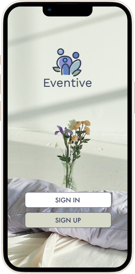
Eventive is a mobile first platform that allows users to plan for their next event using a simple and stress-free system to coordinate and organize their upcoming event.

Responsive Website
Role: UX/UI Designer
Duration: ~12 weeks
Background
Event planning is a daunting task and oftentimes planners find themselves overwhelmed organizing their event schedule while bouncing between apps to fulfill their dream event. What if there was a simple and chaos-free platform to organize your upcoming events?
I identified that current event planning platforms are often confusing and difficult to navigate causing unnecessary stress to the event planner.
Problems
Goals
Taking advantage of the mobile society we live in today I wanted to create a mobile first platform that allows users to plan for their next event using a simple and stress-free layout to coordinate and organize their upcoming event.
Research
I conducted competitive analysis on three similar existing companies in the field gave me a broader scope on issues faced, and potential solutions while also providing insight into both customer and company preferences.
I conducted interviews with perspectives from both attendees and event planners to better learn what tools and platforms current event planners, attendees, and event staff use in planning an event. I wanted to see if there were any current trends in events and platforms and any difficulties that come from attending or hosting an event.
Methodologies
Competitive Analysis


User Interviews
I carried out interviews with 6 individuals in their mid 20’s to 30’s with varying event planning or attending experience. I carried out interviews with perspectives from both attendees and event planners to better learn what tools and platforms current event planners, attendees, and event staff use in planning an event. I wanted to see if there were any current trends in events and platforms and any difficulties that come from attending or hosting an event.
Some key takeaways from the interviews and competitive analysis were
All who were interviewed use multiple platforms in order to both attend and host an event
Most interviewees expressed a desire for streamlined platform “one-stop” or simplification of existing platforms
Lack of organization tools to track tasks
Within the sample interviewees, Eventbrite and Facebook are leading in most used platform aside from messages and email
Define
After having completed interviews and having a basic understanding of needs and pain points to note, I created personas embodying various traits of interviewees and created two personas. These personas helped me understand the user I was designing for and helped guide my ideation process.


After conducting interviews, creating personas, delving into the research and completing simple brainstorming POVs & HMW exercises, I focused on the user’s needs and wants and began creating structure to the website.
Creating the user and task flows helped me visually get a better understanding of the user’s path in completing important tasks and navigating the site.
Sitemap Structure


Design

Keeping in mind all the research that went in before this stage, I began my design process and initially started with some messy sketches to get my ideas down on paper. After sketching my ideas and deciding what would be necessary with the help of my mentor, I created my low-fidelity sketches and mockups through Figma.
low fidelity wireframe

After creating the low fidelity mockups, I created a viewport through desktop that would allow users another method of using the site. Although my site is mobile-first, I kept accessibility in mind and created an optimized desktop view

UI Design
After finalizing mockup designs and creating various viewports, it was finally time to delve into the visual UI aspect of the platform. I started with creating a mood board to capture the brand in its’ entirety and any inspirations that would come. In doing so, I was able to brainstorm and begin designing my UI Component Library to solidify my choices in reflecting my brand values and overall theme. This was my favorite aspect and section of the project as it challenged my design eye while keeping the new UX information I had learned in practice.

Prototype & Testing
With my visual design backed by research in place and with the feedback from peers and mentor, I moved onto hi-fidelity mockups and prototyping to test my features and navigation.

Usability Testing
Conducting usability tests at this stage was important because it allowed me to identify and validate what needed to stay or go in terms of design and flow. I needed opinions and feedback from various participants to help test out and evaluate my prototype. In order to do this I conducted another round of interviews but this time, testing task flow prototypes I had created with real users. During the testing, users had to complete three tasks.
Task 1
Onboarding & Creating an account
Task 2
Creating a new event from the dashboard
Task 3
Editing created event through the dashboard
My initial measure of success was timing of task to completion and degree of understanding from users. Imade sure to make note of any errors made or if they deviated from the task and any other key note we came across. I also included a degree of difficulty (1-3, 3 being the hardest) for the users to grade the task upon completion. My key takeaways from my usability testing were as follows
Test results found great success amongst each task flow and completed all tasks in under three minutes
Every user found simplicity was key
All participants agree that the creating account task flow leading into the creating an event flow was straightforward and relatively easy to complete. This was an expected result as the goal was to simplify the user’s needs as much as possible through my design.
Some users found difficulty in the navigation during the testing of the prototypes due to lack of content, this was an expected result due to limitations on interactions during the task flow aside from given interactions.
Two of the six participants explicitly stated confusion on the edit task flow stating the need for more interaction in order to portray an actual edit in information.
All participants felt the overall structure and layout along with the color palette was pleasing on the eye and represented the brand value of calming well
Revisions
Due to constant updating on design based on feedback instead of waiting until the end, I had very few revisions in terms of the functionality of the product. Based on feedback from my users and my mentor, I made some minor UI related visual tweaks in the design. You can read more about it in depth here

Conclusion
Due to this being my first end-to-end design project, I was faced with many unexpected and hard to overcome challenges. It gave me great insight into my own strengths and weaknesses when it comes to UX/UI design. My key takeaways from this project are
Delve deeper into user research and embrace the research as more is better
Explore more prototyping and offer more choices to users when testing to fully explore capabilities of platform
Rely less on my graphic design background and immediately go for the “designing” aspect of the project
End-to-end style project helped open my eyes to the fact that I am more UI savvy than the research and easily identifying user pain points
Going forward, I’d like to explore ways to prototype more functionalities of the platform to further engage the user. Further steps would be to explore ways to expand the features available to the platform to better mimic and be more competitive in the market to find more users that would need my product. Overall, despite the challenges and difficulties I faced, I learned a lot about myself as a designer and my future as a UX/UI designer. I learned which skills to focus on and which skills I need to hone for future endeavors. I have a long way to go, and I’m always striving to learn more.
Thanks for being a part of my journey!


